Prept
Prept was a social web and mobile application that offers online learning tools, focusing primarily on flashcards and mindmaps, in a social environment.
Flashcards (and mindmaps to an extent) have been one of the oldest and most effective methods of studying course material. We’d like to offer these learning tools in an online environment, where students can create sets of flashcards or mindmaps online, access these sets via the web or their mobile device, share with classmates and the general public, and leverage sets already created and publicly available.

Proposed Design
A service that the user would begin via the web.
Service that would continue over mobile (iPhone, Android).
Connect and build social/classmate base via Gmail and Facebook.
Create and share learning sets.
Community could rate shared sets.
Users can earn badges/medals/gold stars based on ratings and contributions
Access and rate existing learning sets.
Flashcards have been one of the oldest and
most effective methods of studying course material
During our design process we found competitors in the same space. We used their products and found designs we liked. The team would meet and pull together our thoughts to help drive our design goals to make the product we felt the market needed. The main problem was the user experience was tedious. The sites were not user friendly and required a lot of difficult manual input for your data into the flash cards. Also, no competitor had found the right mobile solution. This is where we wanted to focus our efforts, so that it was easy to study on the go. Also, the sites felt very sterile and we wanted to through interaction and visual design to make studying fun again.
Our team researched the field and found these main competitors.
http://www.flashcardexchange.com/ - social, large DB, mobile-enabled
http://www.proprofs.com/flashcards/ - well-known, multiple knowledge-sharing tools
http://www.flashcardmachine.com/ - sharing-enabled, but cluttered
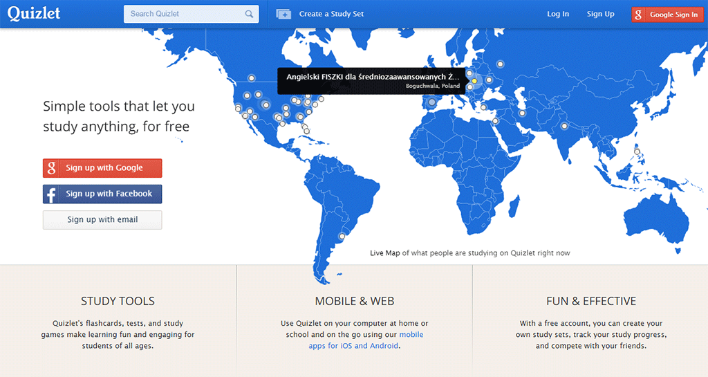
http://quizlet.com - Has free and Quizlet Plus for $10/year (upload images, quizlet badge, unlimited groups)

The team worked in low fidelity wireframes. We all worked remotely, so we would leave our comments and feedback on our Google Docs.
This allowed for asynchronous collaboration that helped with our design process efficiency. Our core feature focused on a digital flash card.

Above is quick walk through of the flash card's functionality. The information was presented and you could quickly tap space bar, click to flip the card over to reveal the answer. For mobile, a quick tap would flip the card back and forth. We also designed a test feature to gamify studying. You could select if you got it right our wrong and at the end of the flash card set you would be given a score and would be able to unlock achievement badges to incentivise more effective studying while having fun. You could then compare your scores with your friends for some friendly competition.

We called the user's collection of flash cards, the Backpack. Users could set their flash cards to public to the community or private for use for themselves or specific users, say people in your class. Our main tool for navigating through the Backpack for both private and public flash cards was search. Flash cards called stacks were searchable by user name, group (class, study groups, subset of defined users), subject (topics) and custom tags. Also, public stacks could be rated by the community to help find the best flash cards for that specific topic.

Our process followed a design outline (01) that would be agreed upon by the team. Once our outline had the right content we would come up with a quick wireframe (02) to help understand how the content would be displayed to the user. This would help cross check our original design outline (01). For example, was it useful to be able to search by study group or could we use that development time for a different feature. By staying in this low cost design space we can quickly pass and fail our ideas to make the best decisions. Once, we found the right design goals and felt the user experience was good for us, I would then take the collaborative wireframe and take it to a final visual design pass (03). Below is how the final design turned out for the Backpack.

Here's a UI previz of how to create a new stack in Prept.